As tax season draws to a close (T-minus 6 weeks and counting), I have been restarting the Quest for More Money. I came across something promising that I originally felt compelled to make new art specifically for, but after thinking about it, I know I have some samples that are “fun and wacky designs and animations” and show “creative ideas and an eye for the playful side of things.”
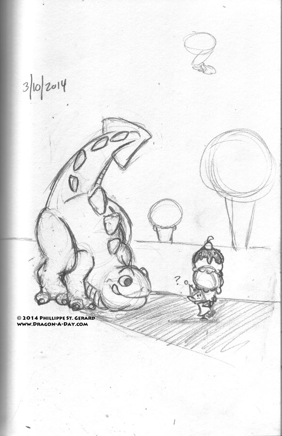
Nevertheless, I found myself thinking of ways to match their aesthetic more closely (it’s a very vector art look, almost like cut paper, and I was not sure if my current black lines would fly with them) and did this while thinking about it:
I know the subject matter is fine, but I’m having more trouble than I should probably be admitting on the Internet (see “authentic communication” from yesterday) wrapping my head around how to represent the large, mostly one-colored mass of the dragon similar to how the company did their stuff.
PS: I don’t know why all these cute dragons like ice cream so much.


